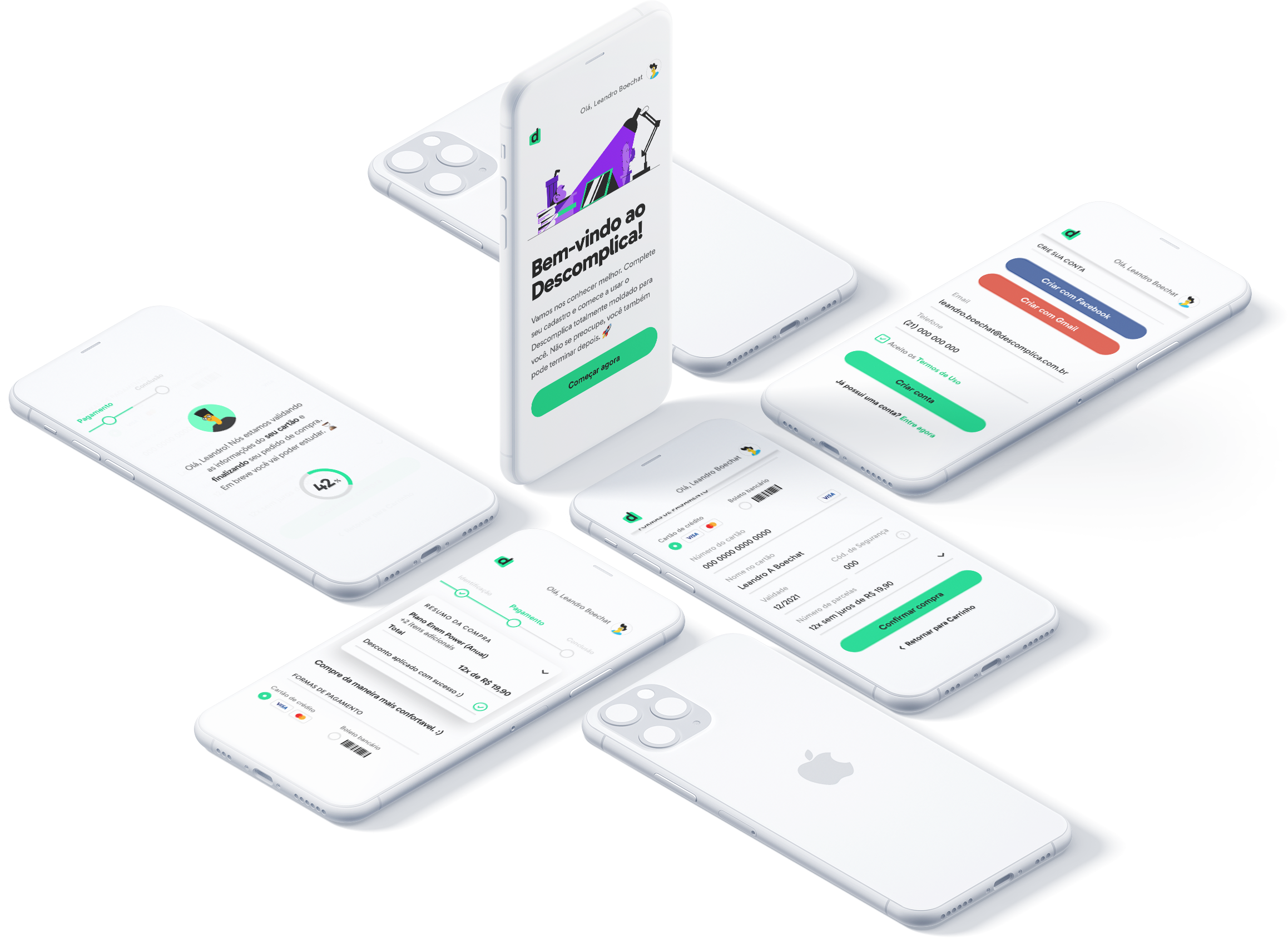
Descomplica's checkout
Making it easier to start learning
Descomplica is Brasil's biggest online classroom with a goal to make education fun and accessible to everyone. The bridge between knowing the product and using it is the checkout process, and during a two months process our team was able to find and deliver a solution that addresses our customer needs.
Discovery
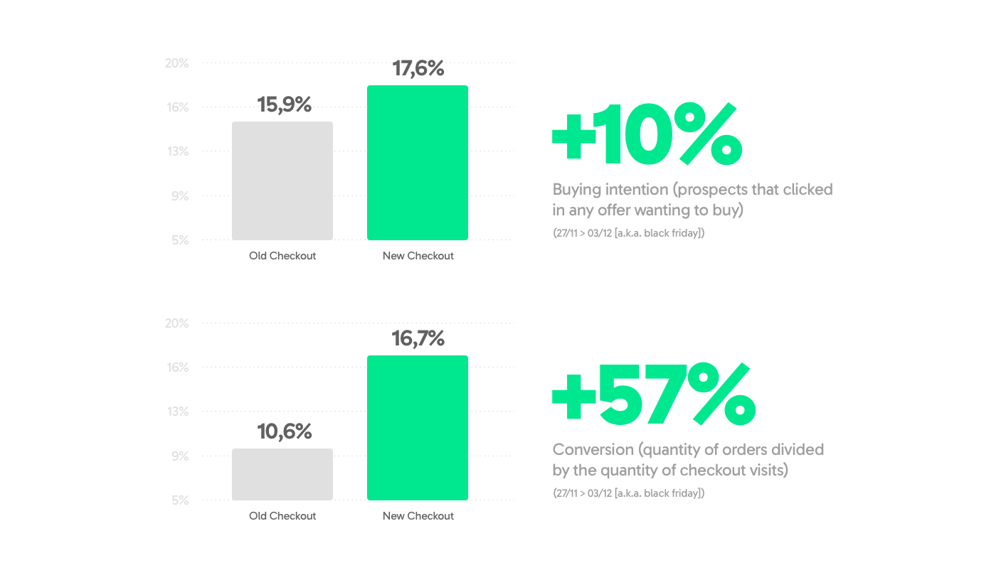
We had a huge amount of buying intention, but during the checkout process the dropout raised during each of it's steps - create account → payment. At the end of the day we had a conversion rate of ~10% of all the people that started this flow.
In this discovery process we had to go deep in research to find more about our prospect users. Descomplica is main audience is Brasil's lower-class and for those who have very few, payments are always a sensitive subject. Some main points we've gathered:
- Most of Descomplica's prospects are unbanked
When paying with credit cards, they usually pay with someone else's card; - Payment slips are very common among them, but lack instructions;
- By combining this qualitative insights, the possibility to increase conversion rate and the opportunity to redo one the most antique parts of the product, we saw a clear gap to explore deciding to redesign the whole checkout.
By combining the data from these interviews with others conducted in our lab, and also talking to a lot of our employees about their finances, we were able to come up with eight personas that represent a gradient of behavior and demographic patterns.
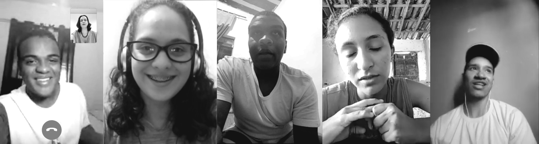
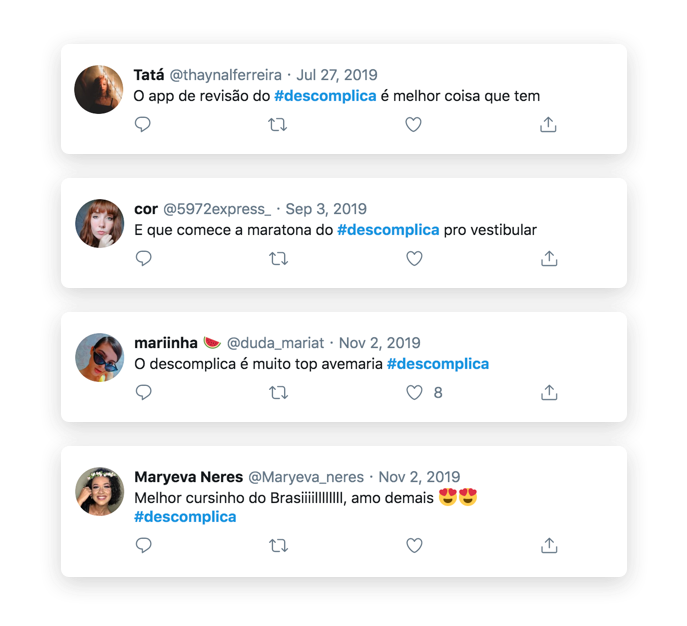
Constantly talking with our main audience gave us great knowledge and insights.
Development
We started the balance and prioritise pain points that were huge when choosing to dropout a checkout flow. Things such as always having a visible understand of what you're buying made a great difference to our customers, specially when you're not paying with your own credit card. The (now)old version of the checkout had so many consistency problems that the quick-wins were right there clearly exposed and the chances to add more value/credibility were just waiting. We focused now on attaching all this UXs improvements with needs based on our user pre-existing mental models.
 Prototyping
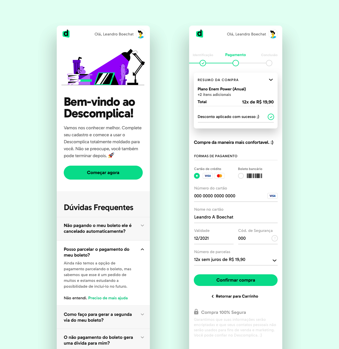
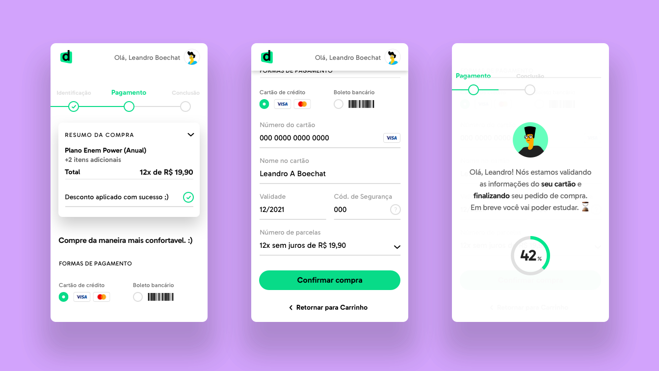
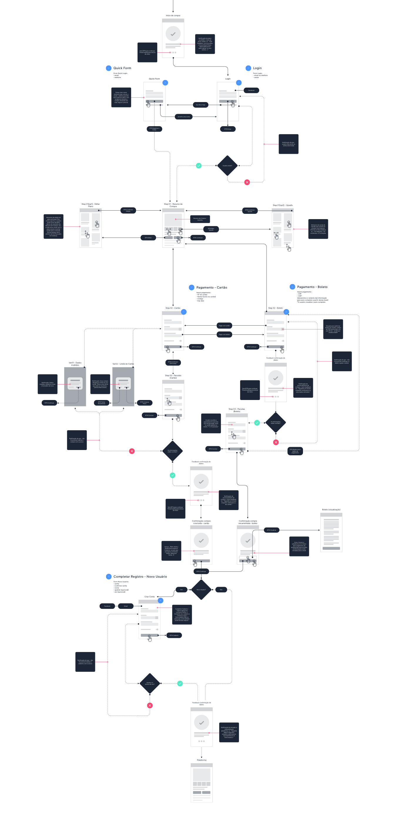
We came up with all the quick-win hypothesis in a brand new solution and also mapped several future tests. We built flows and screens on Sketch to test account creation/payment methods flows and other empty states. Working side-to-side with Edgard Kozlowski, responsible for developing a high fidelity prototype, we managed to come up with a experience that covered all the user journey, since the "intention to buy" till the "buying confirmation". Time to test! During one week, we've tested it with eight different people, all non subscribers, most of them afraid to online shopping. The results showed us that, in all cases, there's always a moment when people consider what they're doing - even the impulsive ones - and they need to feel safe of the choice they're doing. The impression about the new checkout couldn't be better and trimming some edges we're confident to deliver the MVP.
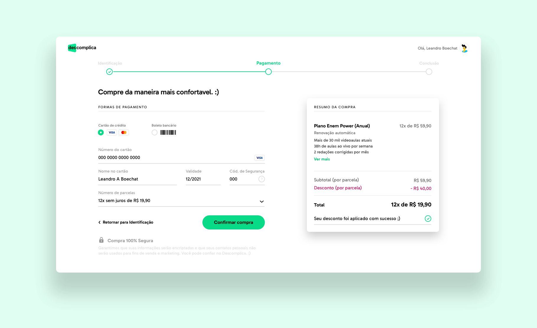
For the conclusion step we tried to bring a little bit of Descomplica's look n' feel.
Results
The MVP was tested on a AB test during the year's top sales peak, black friday. Descomplica's new checkout needed to become clearer and for everyone, like the company likes call the product itself, and in this week test the results of our MVP were 57% than the other option.
Bold move, great results.
More Work